I’m not much of a visual designer. I know the basics and think I have an adequate aesthetic sense, but I can’t draw and only sort of know my way around Pixelmator. Having a good app icon is pretty important, though. Being that I don’t know much about icon design, my plan was that since I was already going to hire an artist to paint the book’s cover, I’d just use the cover for the app’s icon.
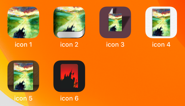
It ended up being a lot harder than that. Here are the major version revisions the icon went through:

Icon 1 is simply the cover. Since the app runs on iPhone and iPad in both landscape and portrait orientations, I had asked for the artwork to be square. On vertical screens the left and right get cropped out. When rotated, the top and bottom go away. As an icon, though, it 1) just looks like a tiny watercolor on your home screen and 2) doesn’t say much about what the app is.
App icons are superellipses. Books are rectangular. Icons 2-5 are my attempts to make the icon say, “this is a book.” 2 would have needed some more polish and I sort of like it, but ultimately I think the shape is a little too funky.
I really like icon 3. I tried to get the shadow the book is casting to match the angle of the castle’s shadow on the cover and I think the effect is neat. The book shape is too small, though, especially at iPhone size. It just comes across as a weird, indiscernible splash of green and yellow.*
Icons 4 and 5 just put the book as an object inside the icon’s shape. 4 uses the same paper text as the book’s pages inside the app. 5 is me trying to replicate the old iBooks app’s bookshelf appearance.
A note on design trends: in the early days of iOS, apps tried to look like the physical objects they represented. Notes, with its Markerfelt font, looked like a yellow notepad. Music on the iPad looked like a Braun record player. The term for this is “skeumorphisim.” Steve Jobs liked it.
Over time, skeumorphic design went out of favor. Apps were supposed to be more “honest” about what they were. Real, physical buttons have grooves on them so your fingers can grip them. Onscreen buttons aren’t actual buttons, so they needn’t resemble them. You can sort of say this trend came along as people got more used to touchscreen interfaces. Early on you make something look like a physical object the user understands. Later, once people are familiar with how an iPhone works, you can take away the training wheels.
I miss it, though. The early designs had more character than some of the newer stuff, and I made a few attempts to hold onto it where I could. Wallachia uses a faint paper background on its pages. Early on in development, when you turned the page, it would just cross dissolve to the next one. It looked nice but I wanted the throwback feel, so I redid the whole thing using Apple’s semi-antiquated Page View Controller just so the pages could flip.† Chapter titles and hedera are red and use a letterpress effect to make them seem like they’re actually stamped into the paper. Interface elements like the play button mimic the letterpress effect, with the idea that any red you see was pressed into the paper as a separate process.‡
All of this to say, I really wanted a skeuomorphic icon, but the design trends of iOS are against it. Icons 2 and 5 in particular ask you to believe the icon is a physical object, but all the other icons next to it on your home screen don’t. What angle should the light be coming from? On contrast, Mac app icons do represent actual things, and Apple has provided specific guidelines on considerations like what angle they should be sitting at so that they’ll all feel at home next to each other. And in general the book cover just has too many colors compared to most icons, which tend to have just two or three.
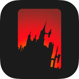
Grudgingly, I said, fine, I’ll see what a new style iOS icon would look like. I identified the castle’s shadow as the most—if you will—iconic element of the cover, traced it out, and placed it into an icon template. Then I figured, if I still want it to very subtly say, “this is a book,” I can frame it in a book-shaped rectangle (rounding the corners slightly).
I made a palette of Apple’s system colors and played with it some. My wife got interested, took the computer from me, and within seconds came up with the idea that maybe the background could look a little bit like a sunset. I knew immediately that was the right approach. Weeks of tweaking§ and I was (and remain) taken with the result.

At some point I’ll probably hire an actual artist to redo the whole thing and make it a bit cleaner, but for a v1, it works.
Finally, as I was making the trailer and thinking about advertising, I thought it could be interesting to animate the icon. My first thought was to try to depict a day, with the sun setting behind the castle. I even looked up specifically how long the shortest day of the year is in Romania (to minimize daylight for the vampire’s sake), and animated a moon rising across the sky. It could probably be made to work (again, I’m only pretending to know what I’m doing with this—as an icon designer, writer, or app developer for that matter!), but I scrapped it in favor of trying the old film effect I settled on.
You can see the animated version at 0:54 in the trailer.
* Two asides about icon 3: first, the unreadable text on the the open page is, of course, Here's to the Crazy Ones. Second, I did wind up using the idea of following the shadow's angle on the book's lettered cover in both the text's shadows and the angle of the italics. The happiest day of my entire life might be when I showed it to my wife and she immediately picked up on the italics thing without me having to point it out. She's pretty great. ↩︎
† I went a little off the deep end on the page flipping. The Table of Contents is invisible as you're paging thought the book. There's no reason to come across it when you're just reading from page 1, so I don't show it to you unless you press its button in the upper-right of the screen. But how to animate it? Well of course the pages turn to get you there. If you're into the book, they flip backwards, like you're turning back to it in the book. If you're in the front matter, though, it flips forward to get you there, because tables of contents come after the cover, dedication, and epigraph. And then of course all that work got screwed up when I decided late in the game to add an introduction to Wallachia. Introductions are supposed to come after tables of contents. Maybe I'll hard code that in in a future update. Until then, forgive me! ↩︎
‡ Apple's new SF Symbols system in iOS 13 may mess this up---I intend to use them but don't think you can apply text effects to them. ↩︎
§ Should the gradient go from from yellow to red or red to yellow? What do sunsets look like, anyway? How do you know it's not a sunrise? Should the castle be straight up, or on a tilt? It's a shadow on the cover but here's it's a silhouette---does that come through? ↩︎